 Academia
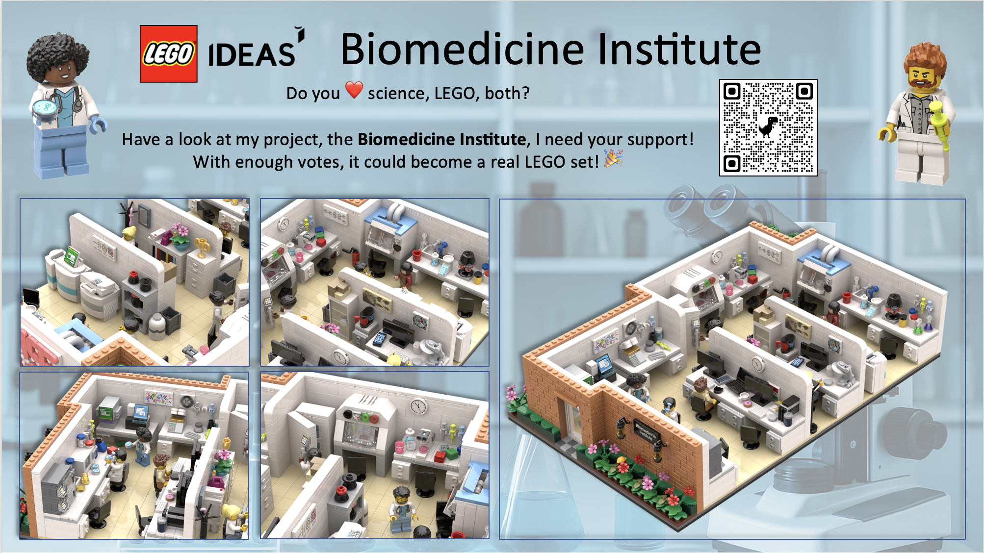
 Ai
Ai
 Astronomy
 Biology
 Chemistry
 Climate
 Conspiracy
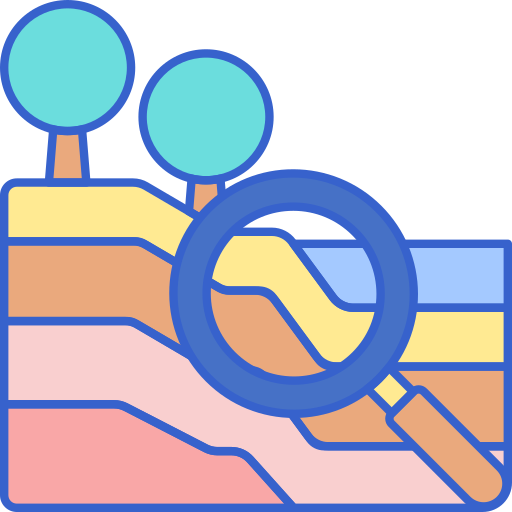
 Earth-science
 Engineering
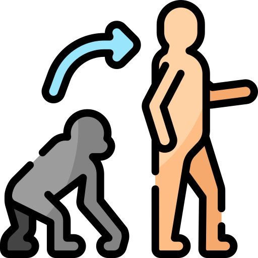 Evolution
 Geology
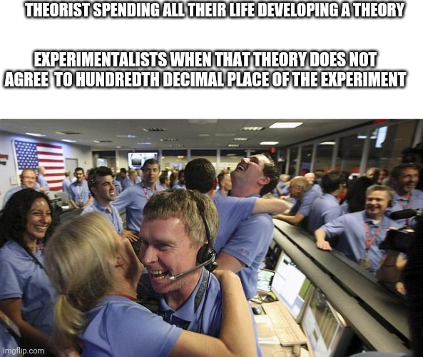
You're cruising through a paper, feeling smart, nodding along with the introduction... then BAM! The methods section hits you with a scatter plot explosion that looks like someone sneezed data points across six dimensions! 😱
That face is the universal "I've made a terrible mistake" moment when you realize those R² values and diffusion axes are speaking a language your brain isn't fluent in. It's the scientific equivalent of thinking you're in a kiddie pool and suddenly finding yourself in the Mariana Trench!
Pro tip: Nobody actually understands those graphs either—the authors just threw in extra plots to impress the reviewers. The secret handshake of academia!