Typography Memes

Posts tagged with Typography

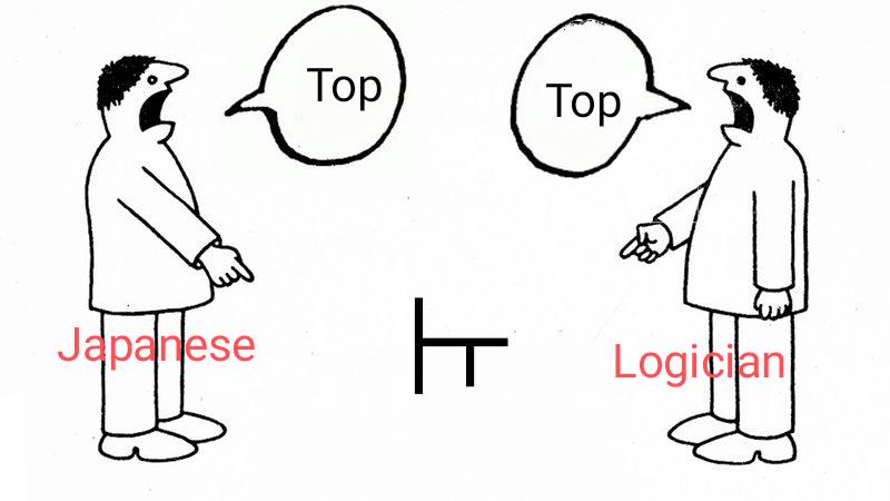
Sometimes, Right Or Wrong Does Not Depend On Perspective

Sometimes, Right Or Wrong Does Not Depend On Perspective
When a Japanese person and a logician look at the same symbol, they're both technically correct from their frame of reference! The symbol "⊥" appears as a "T" rotated 90 degrees. To the Japanese person, it's clearly "top" since in Japanese typography this character represents "top" or "above." Meanwhile, the logician sees the same symbol and also says "top" because in formal logic, "⊥" represents a contradiction or "top" in lattice theory. Two completely different knowledge domains arriving at the same verbal conclusion while meaning entirely different things! The universe really does have a sense of humor when it comes to cross-cultural symbols.

Fonts Matter: The Engineering Of Perception

Fonts Matter: The Engineering Of Perception
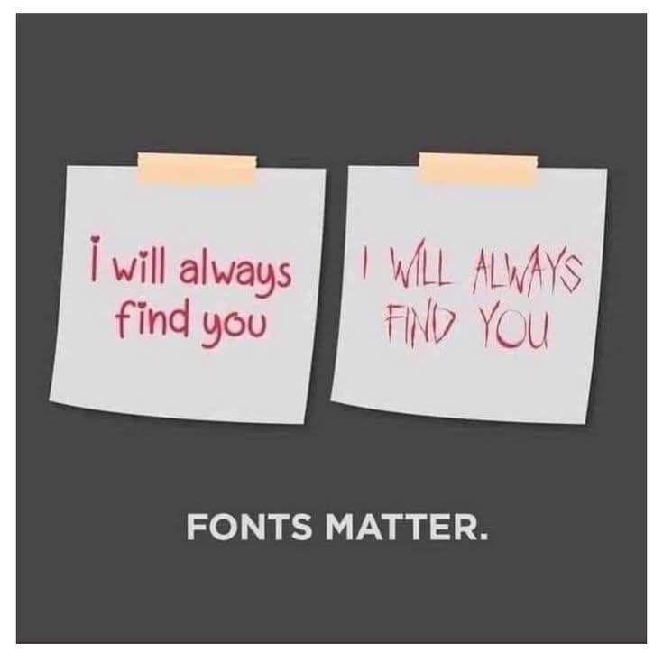
Same message, wildly different vibes! The left note is a sweet declaration of eternal devotion. The right one? Pure psychological thriller antagonist. Engineers know presentation can transform meaning completely—whether it's documentation, UI design, or that email to your boss explaining why the server crashed. Typography isn't just aesthetic; it's functional communication. Next time you submit that technical report in Comic Sans, remember you're basically threatening everyone.

Redacted Until Observed

Redacted Until Observed
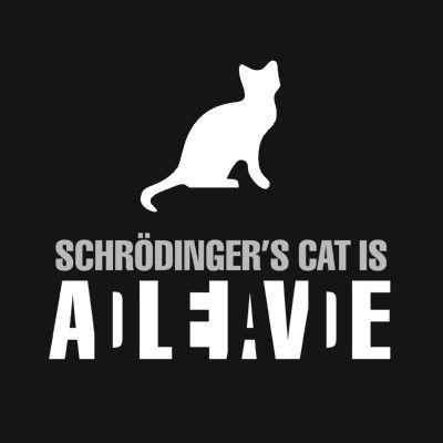
The ultimate quantum superposition joke! The text reads "Schrödinger's cat is ALIVE/DEAD" with the letters cleverly arranged so you can read both states simultaneously. Just like the famous thought experiment where a cat in a box is theoretically both alive AND dead until someone looks inside. The meme brilliantly captures quantum mechanics' weirdest concept with typography that exists in multiple states at once. No cats were harmed in the making of this physics paradox!

Why Would They Nerf The Sigma Symbol's Height?

Why Would They Nerf The Sigma Symbol's Height?
The mathematical community is in shambles! The sigma symbol (Σ) just got hit with the nerf hammer. Game developers reduce character heights when they're too powerful, and apparently someone thought summation was getting out of hand. Now mathematicians have to calculate series with a vertically challenged symbol. Next update: integral signs will lose weight and limit arrows will be capped at 2cm. Statistics students everywhere are protesting: "How am I supposed to sum from i=1 to infinity when my sigma can barely reach i=10?"

The Right Angle For The Wrong Degree

The Right Angle For The Wrong Degree
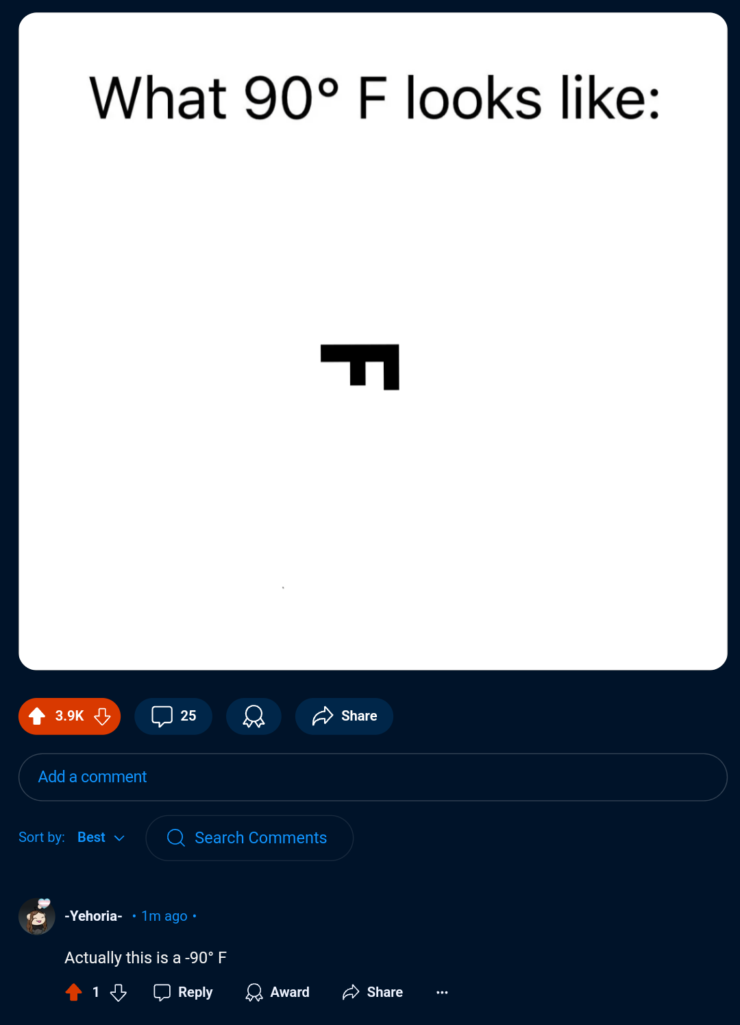
The meme shows what happens when you take math and typography way too literally! The image displays "What 90° F looks like:" followed by the letter F rotated 90 degrees. But the commenter points out it's actually -90° since the F is rotated counterclockwise. It's a brilliant visual pun playing on the dual meaning of degrees—temperature vs. rotation. Next-level nerdy humor that would make your geometry teacher both proud and disappointed simultaneously.

The Mathematical Identity Crisis

The Mathematical Identity Crisis
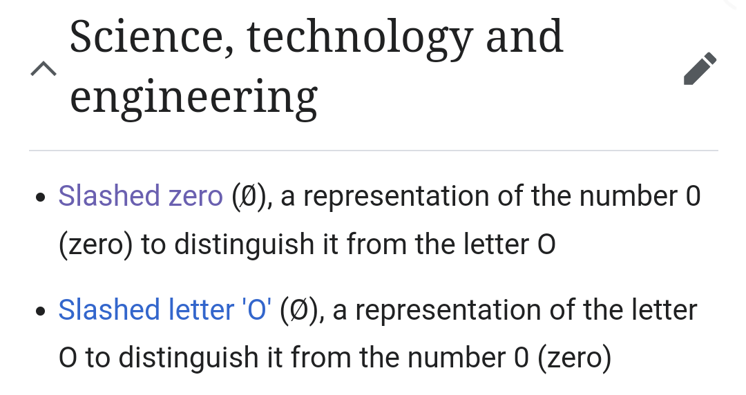
The eternal mathematical identity crisis! Engineers and scientists created two identical-looking symbols with completely opposite meanings just to mess with our brains. One symbol (Ø) represents "nothing" while the other identical symbol (Ø) represents... "not nothing." Then they wrote identical descriptions with opposite explanations. This is the academic equivalent of putting identical twins in the same outfit and asking strangers to tell them apart. No wonder programmers drink so much coffee.

Integral Identity Crisis

Integral Identity Crisis
That moment when your calculus professor uses a fancy "s" in "Calculus" and suddenly everyone's having an existential crisis. The integral symbol (∫) and the letter "s" are having an identity crisis on this worksheet, and honestly, same. Mathematical symbols were just living their best life until some typography nerd had to make things complicated. Next thing you know, students will be integrating the word "snake" instead of functions. ∫tudents everywhere are in pain.

The Sacred Spacing Of Mathematical Typography

The Sacred Spacing Of Mathematical Typography
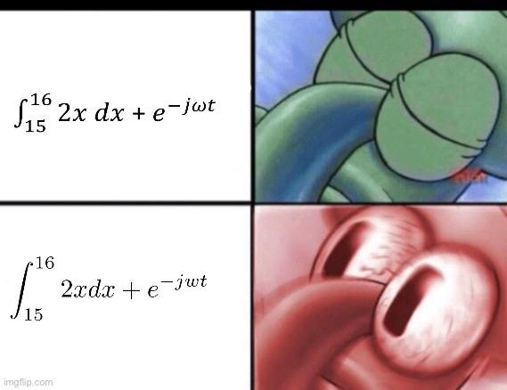
The mathematical typography struggle is real! The top equation shows the blasphemous sin of writing mathematical expressions without proper spacing (2x dx instead of 2x \, dx). The bottom panel shows the correct formatting with proper spacing between variables and differentials - and that intense, bloodshot eye represents every mathematician's visceral reaction when they spot improper LaTeX spacing. The difference is subtle to normal humans but causes physical pain to anyone who's ever submitted a paper to a mathematical journal. It's like nails on a chalkboard for people who spend their lives arranging symbols in perfect harmony.

These Jokers Literally Wrote A 300-Page Compliance Document Entirely In Comic Sans

These Jokers Literally Wrote A 300-Page Compliance Document Entirely In Comic Sans
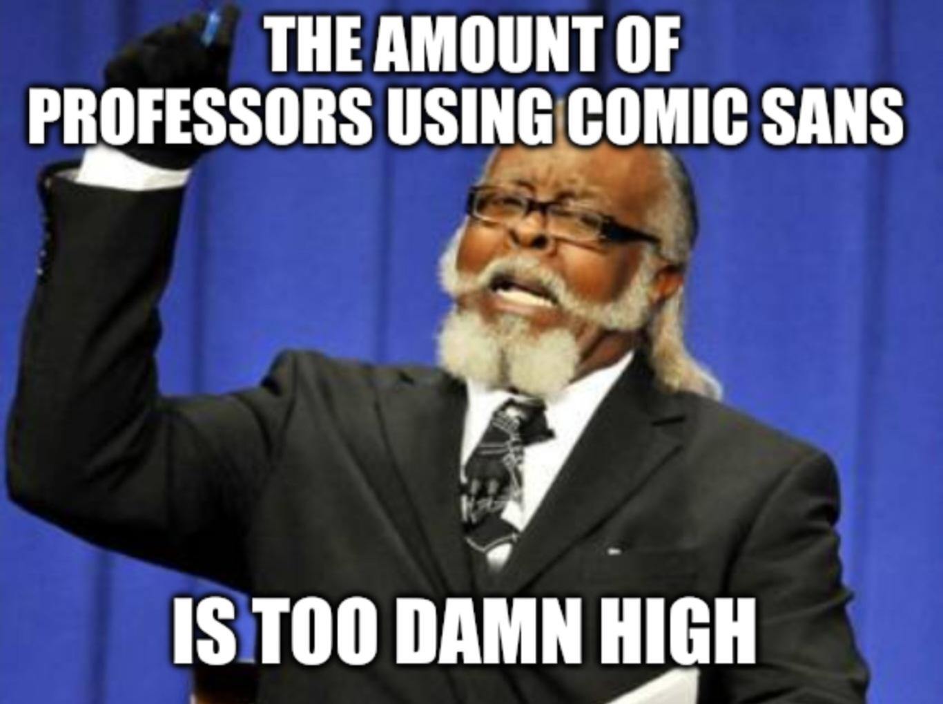
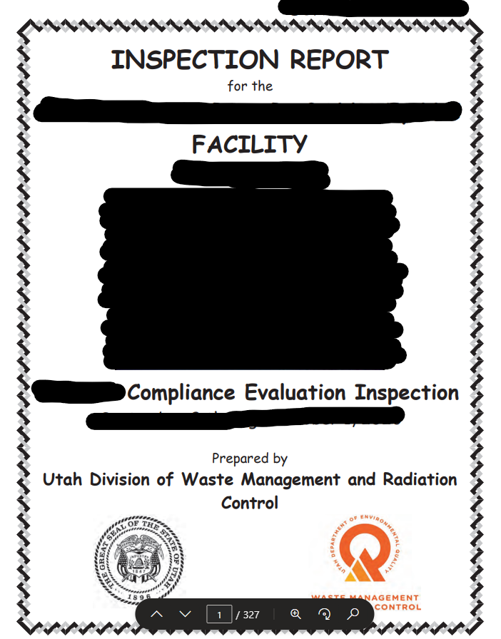
Someone at the Utah Division of Waste Management and Radiation Control woke up and chose violence. Comic Sans – the typographical equivalent of showing up to a nuclear physics conference in a clown costume. The fact that this is page 1 of 327 suggests there are 326 more pages of this typographical crime against humanity. Nothing says "we take radioactive waste very seriously" like a font designed for children's birthday invitations. Imagine being a facility manager, receiving this document, and realizing your radiation safety protocols are being evaluated in the same font used for lemonade stands and lost cat posters. The true half-life of professional credibility? Approximately 0.3 seconds after opening this document.