 Academia
 Ai
Ai
 Astronomy
 Biology
 Chemistry
 Climate
 Conspiracy
 Earth-science
 Engineering
 Evolution
 Geology
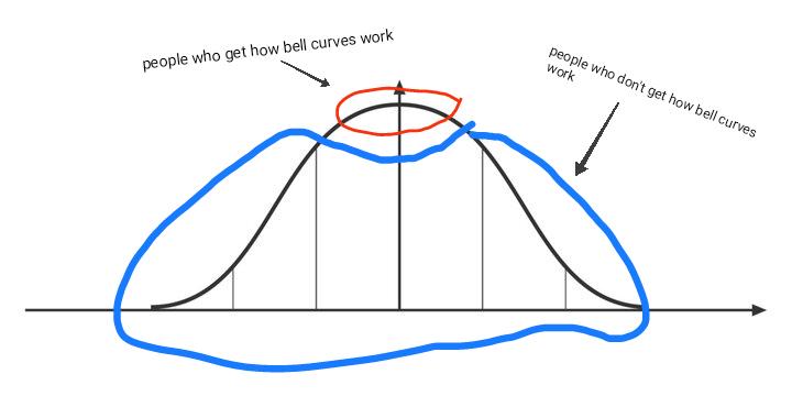
The statistical rebellion is here! Someone took a perfectly normal bell curve and said "nope, too predictable" by drawing a blue blob around it. The original shows people who understand bell curves at the peak (smart cookies!) and those who don't on either tail (statistical rebels).
It's basically statistics humor eating itself! The irony is delicious - by "fixing" the graph with that blue monstrosity, they've created the perfect visual representation of statistical chaos. Normal distribution? More like "whatever I feel like drawing" distribution!