 Academia
 Ai
Ai
 Astronomy
 Biology
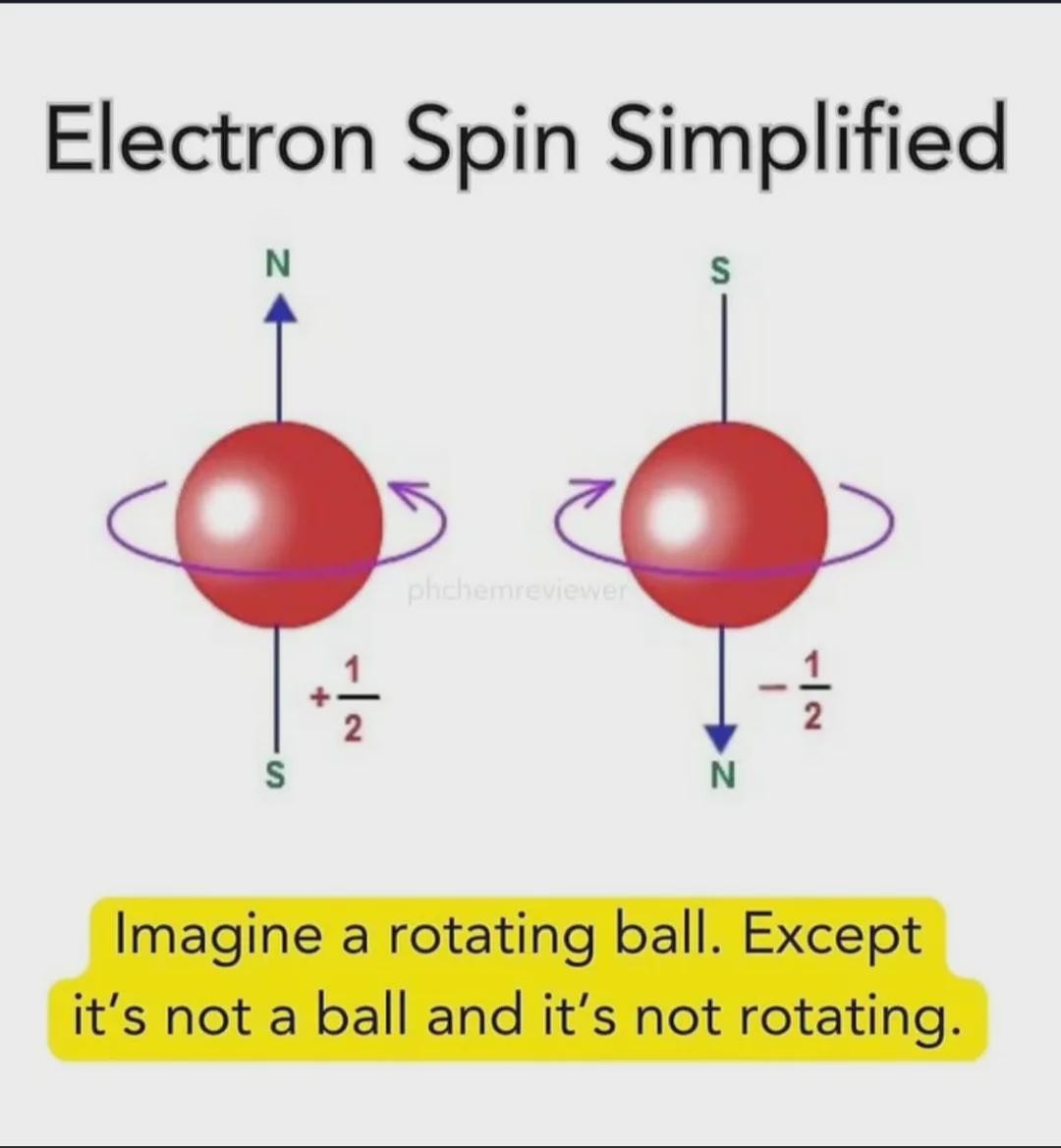
 Chemistry
 Climate
 Conspiracy
 Earth-science
 Engineering
 Evolution
 Geology
HTTP 418: I'm a teapot
The server identifies as a teapot now and is on a tea break, brb
HTTP 418: I'm a teapot
The server identifies as a teapot now and is on a tea break, brb
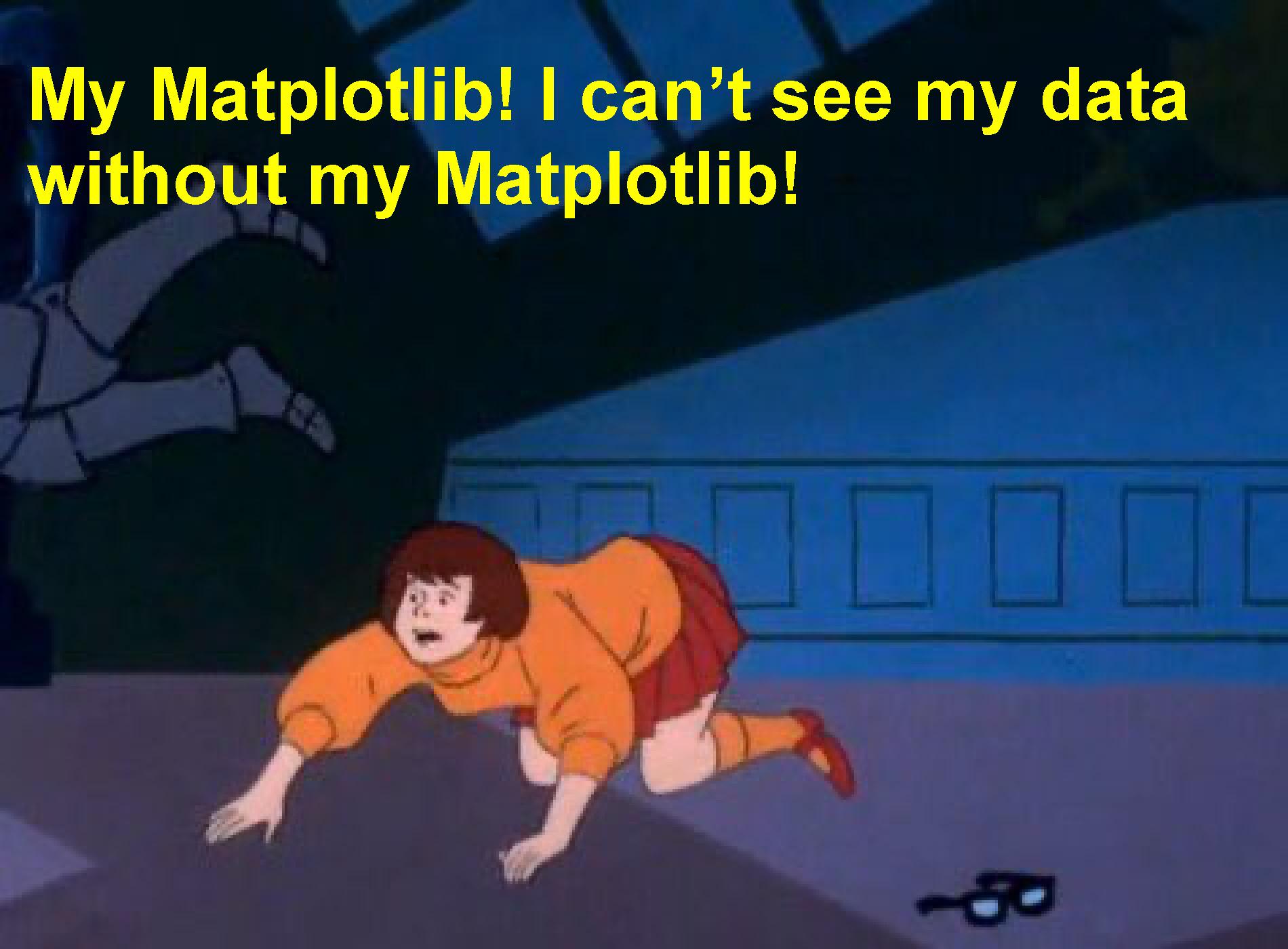
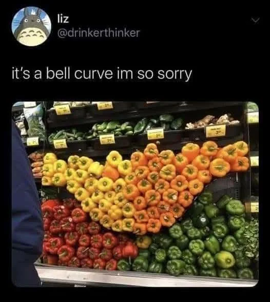
Visualization Memes
Posts tagged with Visualization
HTTP 418: I'm a teapot
The server identifies as a teapot now and is on a tea break, brb
HTTP 418: I'm a teapot
The server identifies as a teapot now and is on a tea break, brb