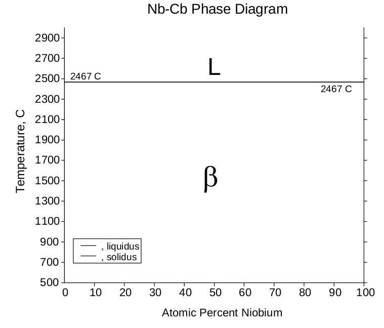
Nothing says "welcome to America" quite like staring at a phase diagram where the temperature axis goes up to 2467°C while you're still trying to figure out if that's hot or cold in Fahrenheit. Your European brain is screaming "why are we using Celsius on a US internship diagram?!" while your supervisor casually mentions something about liquidus lines. Phase diagrams are basically relationship status charts for metals—they tell you whether niobium and columbium are in a solid commitment (β phase), going through a liquid phase, or somewhere complicated in between. The joke here is that US metallurgy somehow ended up with this beautifully metric diagram despite the country's stubborn refusal to adopt the metric system for literally anything else. You can melt steel at 2467°C but you can't order a 500mL coffee without confusing everyone. Also, fun fact: Columbium (Cb) is just the old American name for niobium (Nb). So this is technically a niobium-niobium phase diagram, which makes about as much sense as your first week does.
 Academia
 Ai
Ai
 Astronomy
 Biology
 Chemistry
 Climate
 Conspiracy
 Earth-science
 Engineering
 Evolution
 Geology