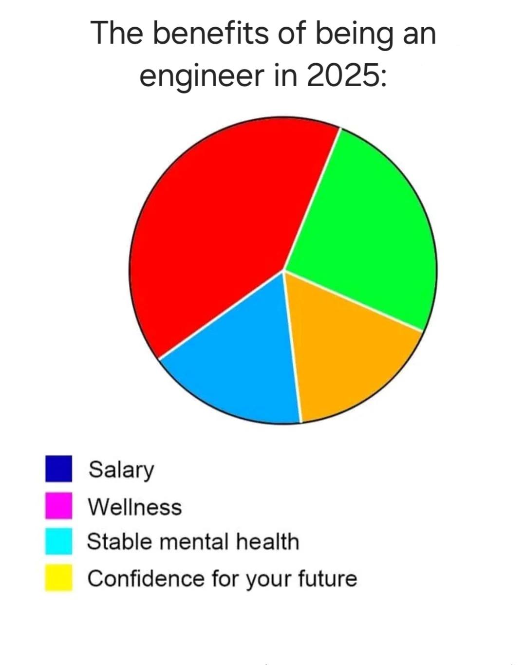
Behold the engineering paradox in colorful chart form! The pie chart shows the benefits of being an engineer in 2025, with slices for salary, wellness, stable mental health, and confidence for your future. But wait—there's no legend for what the actual colored slices represent! Is the giant red section "crushing deadlines"? The green slice "caffeine consumption"? The blue "stack overflow dependency"? The yellow "explaining to relatives what you actually do"? Engineers build bridges, design rockets, and create amazing tech, but apparently can't make a properly labeled chart. Pure chaotic genius! The ultimate engineer move: creating a visualization that raises more questions than it answers. 10 years of experience and still making charts that would make a data scientist weep!


 Academia
 Ai
Ai
 Astronomy
 Biology
 Chemistry
 Climate
 Conspiracy
 Earth-science
 Engineering
 Evolution
 Geology
