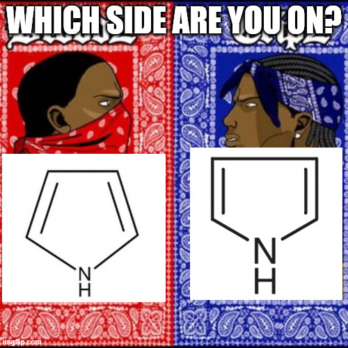
Organic chemistry has its own version of Crips vs Bloods, and it's all about how you draw pyrrole! On the left, we've got the "nitrogen at the bottom" gang – clean, symmetric, aesthetically pleasing. On the right, there's the "nitrogen on the side" crew – practical, ready for mechanism arrows, probably thinks they're being more "realistic" about the structure. Here's the thing: both are technically correct representations of the same five-membered heterocyclic ring. The nitrogen placement is arbitrary since the molecule is planar and symmetric. But somehow this tiny stylistic choice becomes a hill people are willing to die on in chemistry class. Your professor draws it one way, your textbook shows it another, and suddenly you're questioning everything. Fun fact: the side-nitrogen folks often argue it's better for showing reaction mechanisms because the lone pair on nitrogen is more visible. The bottom-nitrogen people counter that it looks cleaner and matches how we draw cyclopentane. The debate rages on in every organic chemistry lab worldwide!
 Academia
 Ai
Ai
 Astronomy
 Biology
 Chemistry
 Climate
 Conspiracy
 Earth-science
 Engineering
 Evolution
 Geology